About:
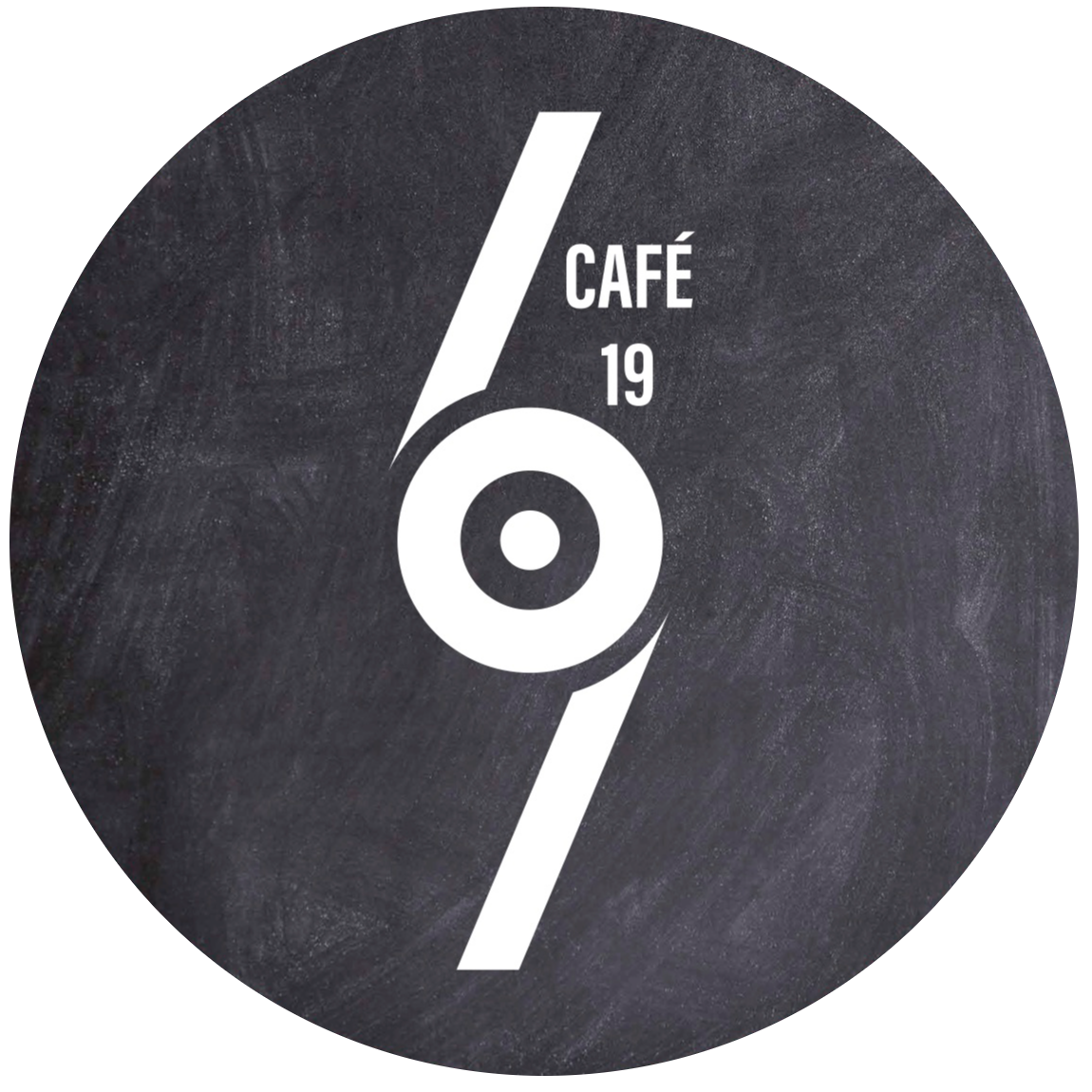
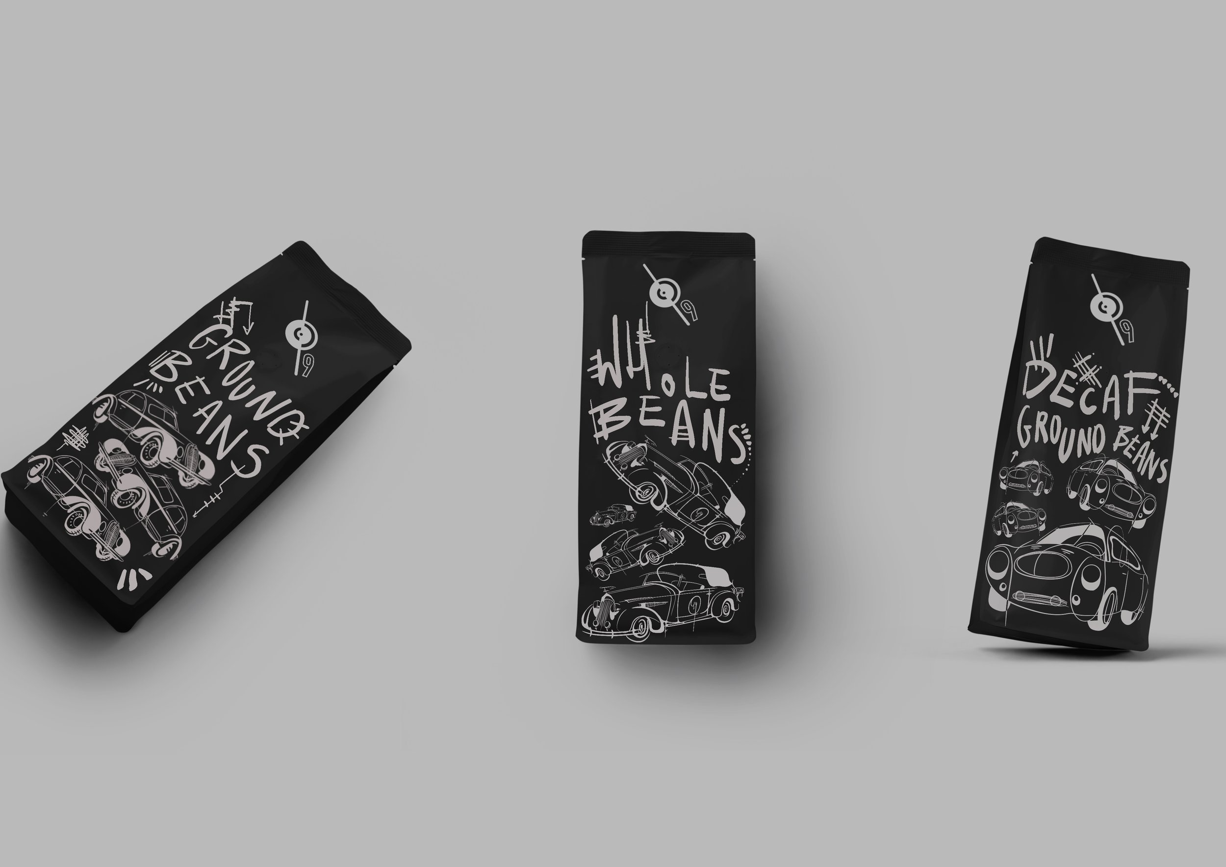
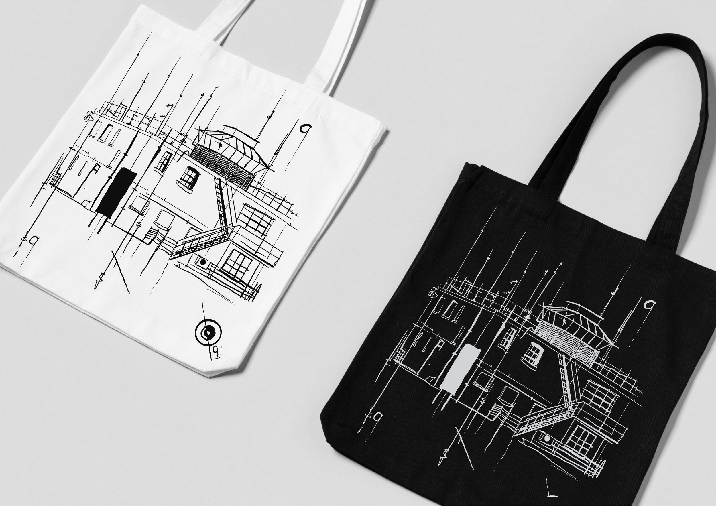
The rebranding of Café 19 was guided by an understanding of utilitarian design, a style prominent during the 1940s and central to the café’s identity. The colour palette draws on slate greys to reference the metals of Spitfires and the textures found in machinery, something important in Duxford’s history.
A simple, punchy logo was developed to reflect the business’s origins, with the café closely tied to Duxford’s history as the home of the 19th Squadron at Duxford air museum. This approach ensures the branding flows cohesively while accurately representing the heritage and character of Café 19.


Original outcomes and exploration:
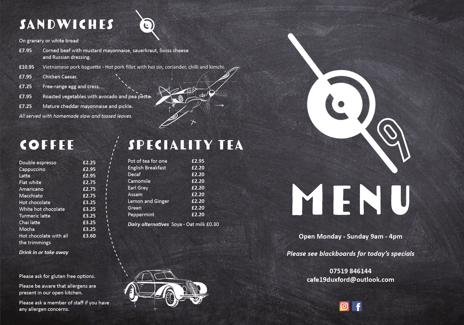
These drawings explore the use of line to create a stylised composition that blends retro influences with a modern, fresh aesthetic. It draws inspiration from a period defined by utilitarian design, capturing both the practicality and the unique visual style of that era. Soemthing I worked hard to incorporate.


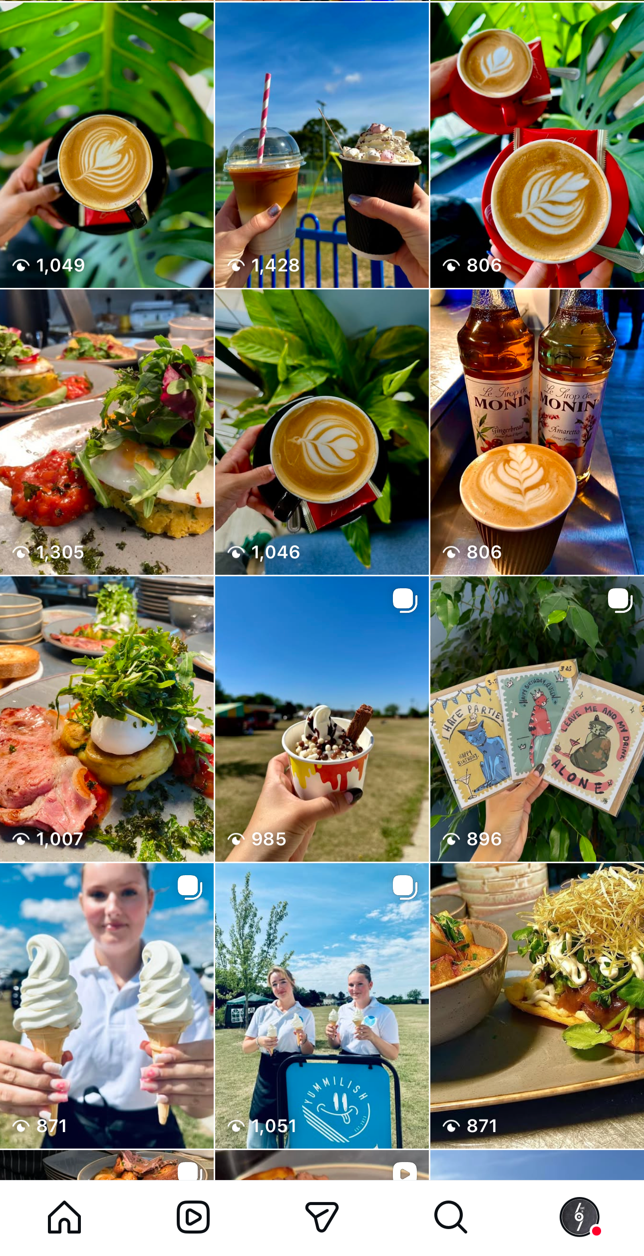
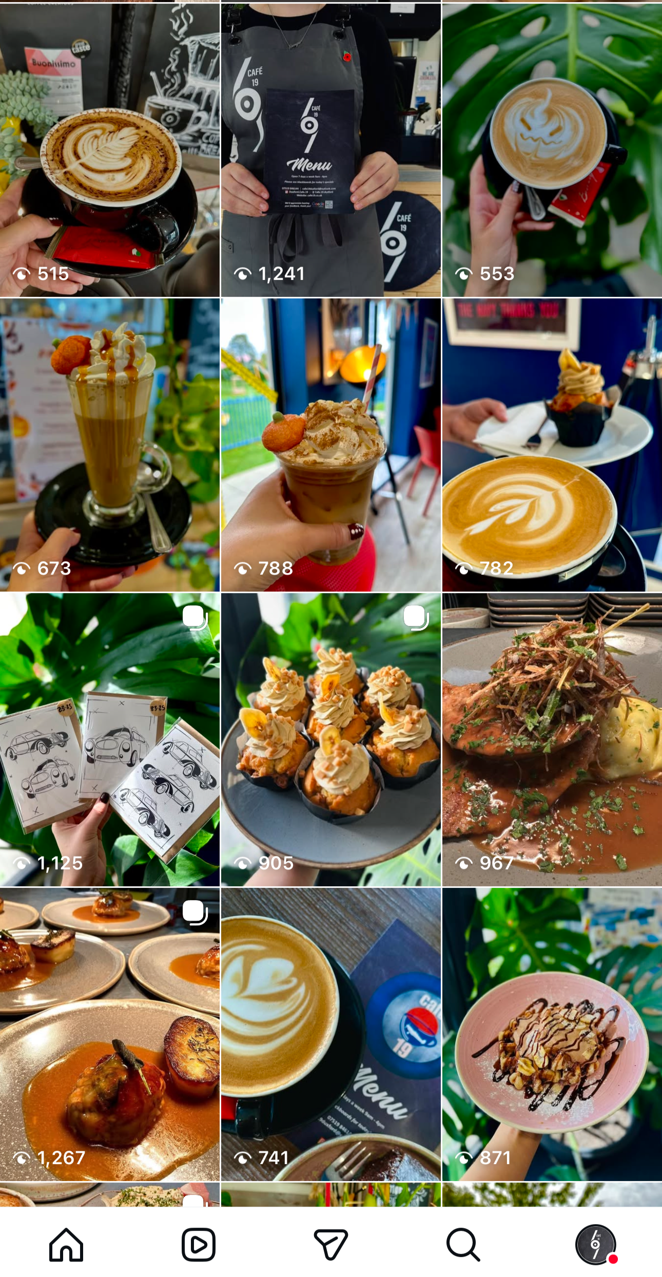
My creativity goes beyond illustration, extending into social media management and web design. I love creating visually engaging content with a modern, refreshing feel. With always keeping to crisp imagery and a pop of colour to bring each post to life
social media management:
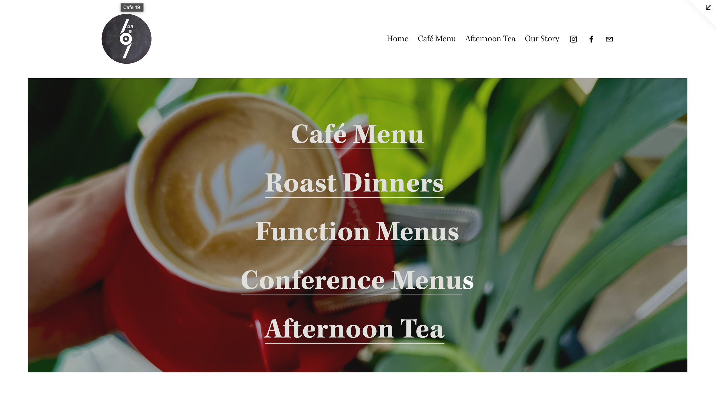
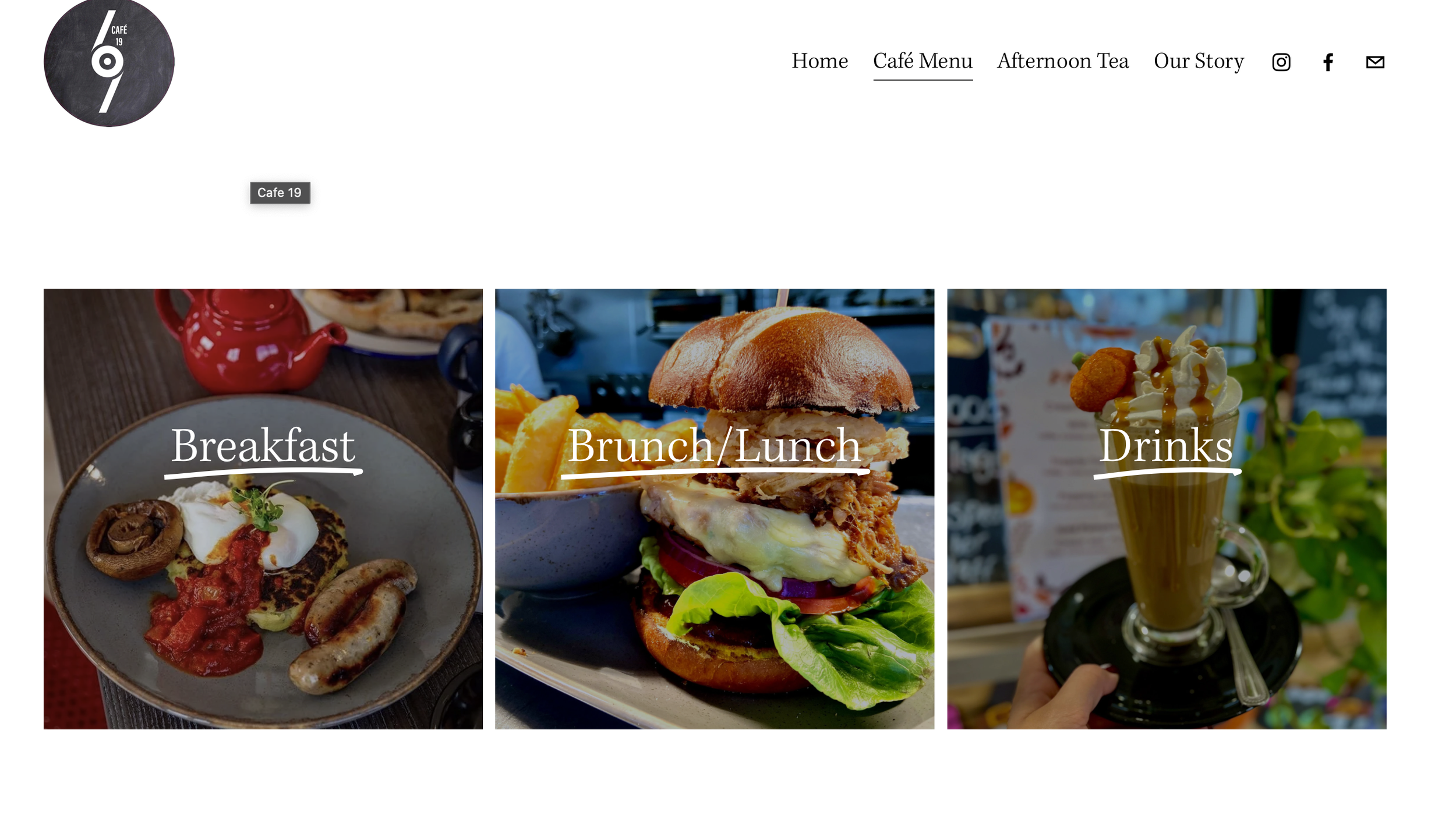
Website Design
& Management: